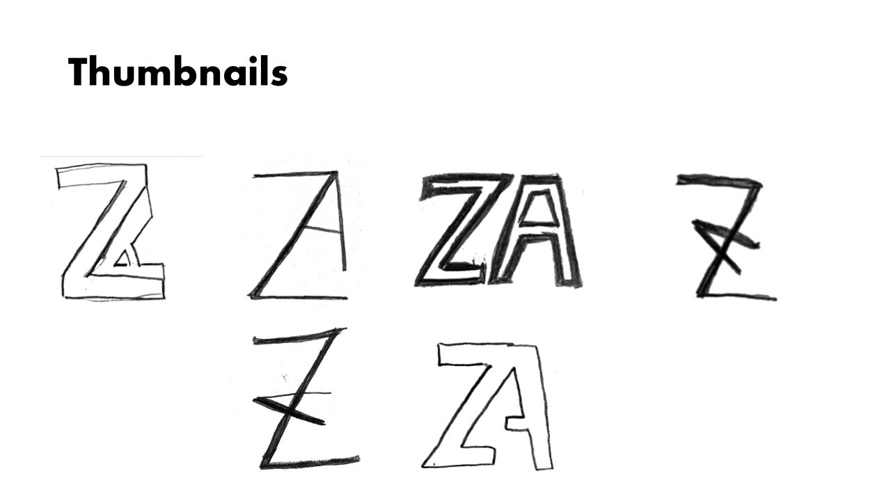
When designing these thumbnails, I wanted to make sure the logo was recognizable and simply to read. I found that when designing these thumbnails that the ones that had the more distinguishable A's were easier to read and therefore better logo ideas.
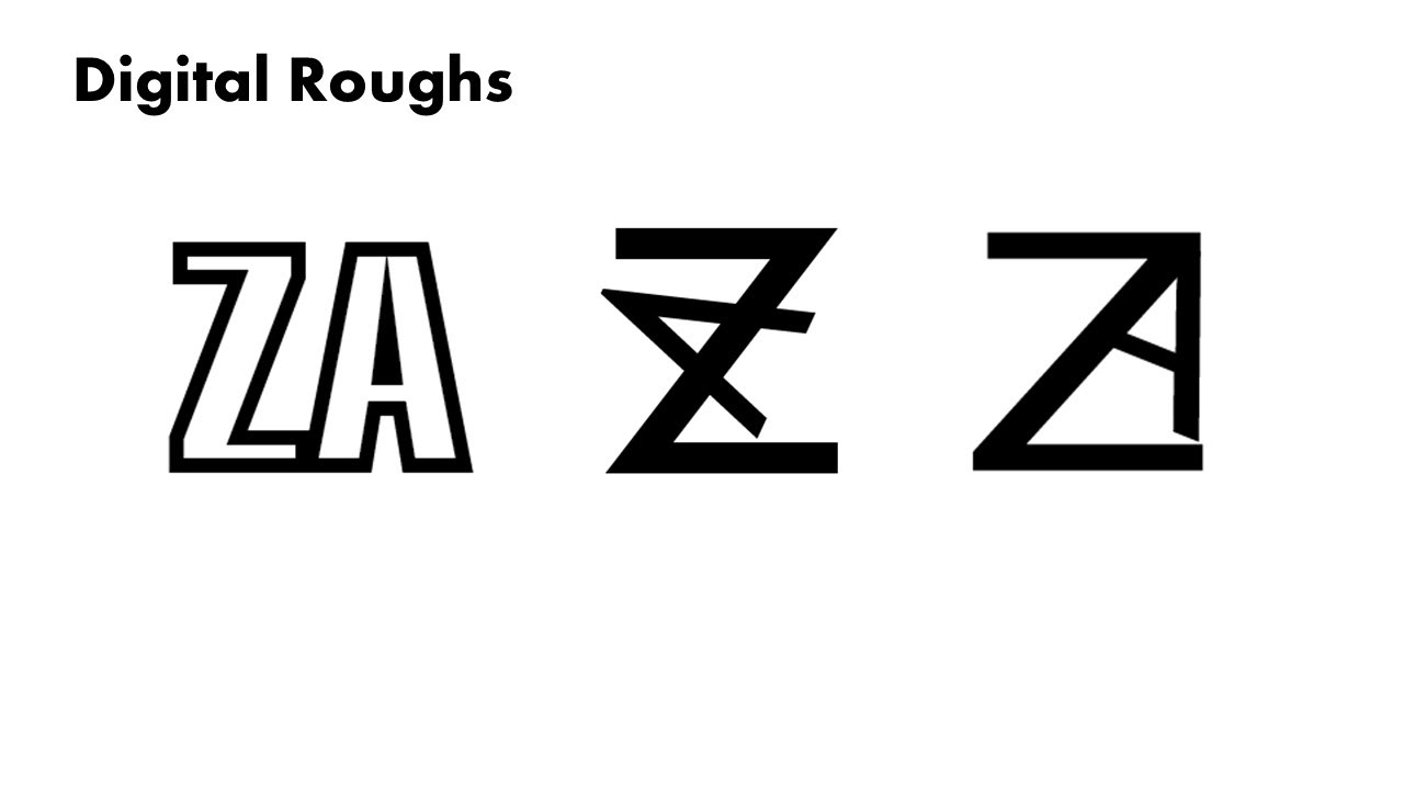
When choosing a final design for the monogram logo I choose the last logo on the right as this logo was the most appealing to the overall vibe of the pizzeria. While I enjoy the simplicity of the other logo designs the middle one can be hard to read, and the first design is too plain.
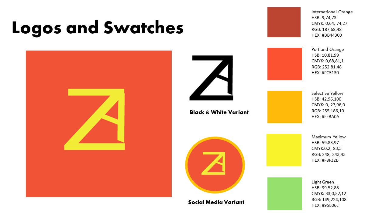
When designing the final logos and swatches I went with a brighter color palette as the brand idea was for a 24/7 pizzeria. The brightness adds to the lively atmosphere that the brand is trying to achieve.